Part I:
This portion of the lab introduces a scenario in which there is a study conducted on crime rates and poverty in a town. The press latches onto a statistic that claims that as the number of kids eating free lunch increase, so does crime. The object of this section is to determine if this has any validity, and determine what percentage of kids on free lunch would yield a crime rate of 79.7.
A table was provided including two columns for each variable: Percent Free Lunch and Crime Rate. SPSS was used to perform linear regression analysis to better understand the relationship between them, with percent free lunch as the independent variable, and crime rate as the dependent variable. The data was returned as follows:
 |
| The above images show the SPSS output for a linear regression analysis on percent free lunch and crime rate variables. Based on the significance value on the bottom right of the bottom table (.005) the null hypotheses that there is no linear relationship between the two variables should be rejected in favor of the alternative hypothesis, which states that there is a linear relationship between the variables because it is outside of the 95% significance bounds of .05. However, with such a low R Square statistic, this relationship is not very strong, and it's predictive value is very limited. |
The resulting data equation from the above output can be put into the regression equation of y=a+bx
Doing this would result in the equation: Y = 21.819 + 1.685x
To calculate the percentage of persons getting free lunch with a crime rate of 79.7, the equation can be transformed as follows:
Doing this would result in the equation: Y = 21.819 + 1.685x
To calculate the percentage of persons getting free lunch with a crime rate of 79.7, the equation can be transformed as follows:
79.9 = 21.819 + 1.685x
x = (79.9-21.819)/1.685
x = (79.9-21.819)/1.685
x = 35.35%
With a crime rate of 79.7, the percentage of kids getting free lunch would be about 35%. It is important to keep in mind, though, that since the R Square statistic is very low, this value cannot be relied on to be very accurate!
Part II: Spatial Auto-correlation
Introduction:
This portion of the exercise included a scenario in which the UW System has requested an analysis of enrollment with respect to a number of variables. These include distance from each school, percent with a bachelor's degree, and median household income. This analysis can be done using linear regression analysis on these variables with the help of SPSS statistics editor. The output from the regression analyses combined with spatial representations of the models' residuals can provide input into why students choose the schools they go to.
Methods:
Data was provided by the professor in the form of a spreadsheet including enrollment data from all UW schools, and some census statistics. The next step was to create a new column as population divided by distance. This is a way to normalize the data to ensure that just because a county has a higher population, the number of students enrolled won't be off the charts. Conversely, counties right next to a school won't be unreasonably favored (because more students will attend closer colleges).
After this column was created and calculated in Excel, regression analysis was performed on these variables with relation to two schools: UW-Eau Claire, and UW- Oshkosh.
After this column was created and calculated in Excel, regression analysis was performed on these variables with relation to two schools: UW-Eau Claire, and UW- Oshkosh.
Eau Claire:
 |
| This image shows the results of the regression analysis with median household income as the independent variable, and UWEC enrollment as the dependent variable. With a significance of .104, you would fail to reject the null hypothesis which states that there is not a linear relationship between the two variables. |
 |
| This image shows the results with Percent with a Bachelor's degree as the independent variable and Eau Claire enrollment as the dependent. This significance is below .05, so you would reject the null hypothesis (same as example above) in favor of the alternative hypothesis which states that there is a linear relationship between the two variables. In this output, the R square value is very low, so the explanatory power of the model is not ideal. |
 |
| This image shows the results from regression with Population per distance as the independent variable, and UWEC enrollment as the dependent. The significance is .000 so you would reject the null hypothesis in favor of the alternative hypothesis in the same manner as the above output. The difference here, is that the R Square value is much higher. The number of .945 essentially means that entries would fit the model 94.5% of the time. This is a very high strength, positive relationship. |
 |
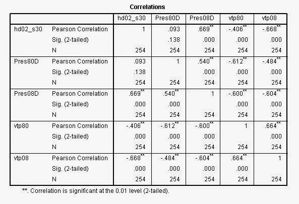
| This image shows the results from regression performed on median household income and UW-Oshkosh's enrollment. This relationship is statistically significant, but the R Square value is low. |
 |
| This image shows the results from regression analysis performed on Percent with a bachelor's degree as the explanitory variable and Oshkosh enrollment as the dependent variable. Again, the relationship is statistically significant, but the R Square value is low, so the model isn't very useful. |
 |
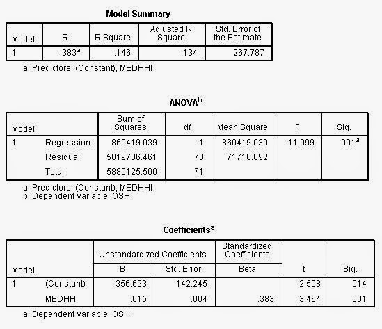
| This image shows the results from regression performed with Population per distance as the independent variable. It is statistically significant with a value of .000 and the R square value is very high. |
The next step was to re-run the regression analysis, this time including residuals. Residuals are basically the values that the model doesn't account for. These residuals are aggregated to the spreadsheet of data, so each county is given a residual value. High residual values essentially indicate outliers in the dataset, with values much higher than predicted in the model. Conversely, negative residual values indicate lower values than the model predicts. These values were mapped using ArcMap, the results are shown below.
Results:
 |
| This image shows the residuals from the relationship between variable: population normalized by counties' distance from UWEC, and UWEC enrollment from each county. |
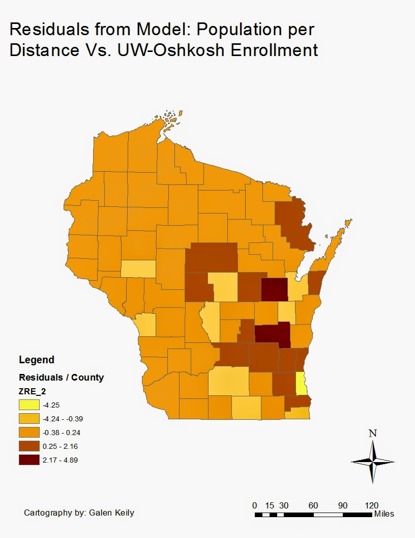 |
| This image shows the residuals from the relationship between variable: population normalized by counties' distance from UW-Oshkosh, and UW-Oshkosh enrollment from each county. |
Discussion:
The results of these maps show some interesting relationships. Because residuals show outliers in the datasets, the dark red areas in each map show areas that produce more students than would be expected based on their distance from each school. On the other hand, the light yellow areas show areas that send fewer students than the model predicts. Exploring the reasons why these high or low outliers are present can help to approach the UW-System's goal of analyzing students decisions on colleges.
Most notable in the first map for Eau Claire are Marathon, Dane, Brown, and Waukesha counties. These are the counties who's residual values are from 1.31 to 2.99. There are a number of counties that have very low residual values as well. (Or they can be seen as high negative values) This means that the model predicted a value much higher than the ones actually present. The highest values in this map seem to be areas that have high populations. Wausau, Green Bay, Madison, and some of Milwaukee have these high values. It is no surprise that places with high populations will send more students, and that when they are farther away, they send fewer. But these counties send uncharacteristically high amounts of students. Though there are no definite answers as to why this is, there are a number of possibilities. Wausau doesn't have a four-year school, and UW-Eau Claire is highly regarded by teachers and community members there. It also happens to be the closest four year school, even though it is about 1.5 hours away. Though Madison and Green Bay are a little bit farther, they still send very high numbers of students. UW-Green Bay is in Brown county, and may be seen as a lesser school than UW-Eau Claire. Students from Dane County may be coming to Eau Claire as an alternative to UW-Madison, which has strict admission requirements. Also, students may interested in going to a smaller school than the UW. An interesting comparison is between Waukesha county and Milwaukee county. Milwaukee county has the lowest residual value of all, and is right next to a county with one of the highest residual values. This could be due to Milwaukee's very high population, in conjunction with its own four year university, and distance from Eau Claire. Waukesha county on the other hand has a much lower population, being about the same distance from Eau Claire. It is likely that they have very similar numbers for enrollment, but population is the difference.
For the second map with UW-Oshkosh, the two highest values are Outigamie and Fon Du Lac counties. UW-Oshkosh is in Winnebago county, and it has counties with high populations on either side. Because they are so close and have high populations, they exceed the model's expected values. It is interesting also to note the areas with low enrollment for how populated/far away they are. Eau Claire, LaCrosse, Madison, Green Bay and Milwaukee are all in counties with low residuals. They all have universities in them, so this is no coincidence. Milwaukee again exceeds all other counties with the highest negative residual value. This could be due again to its high population and industrial nature in conjunction with its own University.
Conclusion:
Regression analysis is a powerful tool to use to examine relationships between variables, and using residual values in a spatial manner can express discrepancies in data very effectively. In this case, examining population/distance and enrollment showed a strong relationship, and a high power model outlining the relationship. As Population per Distance increases, so does enrollment. Mapping the residuals from this model allows for a spatial representation of outliers in the dataset, and provides important information to the UW-System about it's students' university selections.