Part I: Correlation
a.
 |
| The first part of this lab was to determine whether this dataset had correlation between distance and sound level. |
First, I used Excel to create a scatter plot of the data.
 |
| This is a scatter plot of the dataset including trend line. |
Next, I went into SPSS to calculate the Pearson correlation.
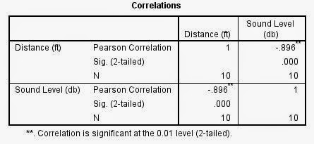 |
| The results of the Pearson Correlation test |
The above chart shows that there is indeed a correlation between the two variables, distance and sound level. The negative value, shown in both the chart and in the downward slope on the graph indicates that the direction is negative, so when distance increases, sound level decreases. The Pearson Correlation statistic is -.896, indicating that the there is a very high strength associated with this relationship. (Rounded up to .9 because strength is categorized in just two decimal places.)
Hypothesis testing for this data goes as follows:
1) State Null Hypothesis: There is no association/ linear relationship between distance and decibal level
2) State Alternative Hypothesis: There is a significant association or linear relationship between them
3) This will be tested with Pearson Correlation test
4) α = .01 (99% significance) with two tails
5) Calculate Test Statistic: r=-.896
6) Make decision about hypotheses: Reject null hypothesis in favor of the alternative hypothesis. There is a high to very high negative linear relationship between distance and sound level.
b.
This mini-exercise included creating a correlation matrix for a number of variables in Milwaukee County, WI. This was done in SPSS, and the results are shown and interpreted below:
 |
| Correlation matrix for variables: Percent White, Percent Black, Percent Hispanic, Percent with no high school diploma, percent with bachelors degree, and percent that walk to work. |
I'll start with Percent white as it relates to other variables. First, it has a high, negative relationship to the percent black variable. This is logical, as they are two unique percentages competing for space in a census tract. With this in mind, such a high strength relationship is more than just a coincidence. This means that where there are lots of white people, there are very few black people and vice-versa. The same is true for the relationship between percent white and percent hispanic, but the strength is much lower. This low of a number barely notes a relationship. This could just mean that a high percentage of white people in a given area, there isn't enough statistical space for a high percentage of hispanics, as mentioned above. Also, There is a moderate negative correlation between percentage of white people and percent of people with no high school diploma. This means that in areas with lots of white people, there are lower levels of people without diplomas. Next, percentage of white people has a moderate positive relationship with the bachelor's degree variable, so areas with lots of whites also yield many with college degrees. There is a high, negative linear relationship between percentage of white people and percent below the poverty line, so areas with high percentages of whites have few poor people. There is no significant correlation between percent white and percent walking.
Next, I'll reference percent black in relation to other variables. There is a significant, negative correlation between percent black and percent hispanic, but it is very low strength, as it was between whites and hispanics. Next, there is a positive, low strength linear relationship between percentage black and those without highschool diplomas. Areas with high percentages of blacks have high percentages of highschool dropouts, in other words. There is a moderate strength, negative relationship between percentage of blacks and percentage with a bachelors degree. There is another moderate relationship between percent black and percent below the poverty line, this time positive. This means that areas with lots of black people have statistically higher percent in poverty. Again, percent walking doesn't have a relationship.
Next, percent hispanic. Relationships with other races has already been discussed, so first I'll note the strong association between hispanics and lack of high school diplomas. They have a low strength, negative association with percentage receiving bachelors degrees, and a low strength positive linear relationship with percent below the poverty line. This means that areas with high levels of hispanics have high percentages of those without high school diplomas, low percentages of bachelors degrees, and moderately high poverty. There is no correlation with percent walking to work.
Next, percentages of those with no high school degree has a moderate strength negative relationship with those with bachelors degrees and a moderate strength positive one with those below the poverty line. This is logical, as it is expected that high school dropouts won't continue to college, and will make less money. Again, no relationship statistically with those who walk to work.
Percentage of people with a bachelors degree has a moderate strength negative relationship with percentage below the poverty line, so areas with lots of bachelors degrees has lower poverty, statistically.
Finally, the percentage of those below the poverty line does have a significant positive relationship with percentage of people walking to work (even though it is low strength). This means areas of high poverty has high percentages of people walking to work, which makes sense.
The general patterns here are unfortunate, but logical. The correlations present indicate that areas with high percentages of white people have low percentages of black and hispanic people, and less prevalence of poverty along with variables associated with it like lack of high school diplomas. This picture looks quite different for members of minorities. The data is almost flipped for percent black and Hispanic people: areas with high percentages of these minorities have high levels of poverty, low percentages of high school graduates, and logically, low percentages of college graduates.
These patterns reflect inequalities that are very real throughout the United States. Using a correlation matrix validates these often subtle inequalities, and demonstrates them in a way that can be scientifically studied. It shows the shortcomings of our social systems here in the US, as close to home as in Milwaukee.
These patterns reflect inequalities that are very real throughout the United States. Using a correlation matrix validates these often subtle inequalities, and demonstrates them in a way that can be scientifically studied. It shows the shortcomings of our social systems here in the US, as close to home as in Milwaukee.
Part II: Spatial Auto-correlation
Introduction:
This exercise includes a scenario in which students were assigned the role of analyzing election data for the 1980 and 2008 Presidential Elections in the state of Texas. The Texas Election Commission needs assistance in analyzing voter patterns for democratic and Hispanic voter data. The goal is to be able to tell the governor whether the election patterns have changed or not in these 20+ years. This can be done using a number of statistical tools, and with the assistance of ArcGIS, GeoDa and SPSS software.
The exercise uses correlation, which tests relationships among variables. It yields strength and direction of possible linear relationships present between variables, but does NOT imply causation. This exercise also relies on spatial auto-correlation, which tests correlation of a single variable over space. This can be a powerful tool for studying clustering patterns.
The exercise uses correlation, which tests relationships among variables. It yields strength and direction of possible linear relationships present between variables, but does NOT imply causation. This exercise also relies on spatial auto-correlation, which tests correlation of a single variable over space. This can be a powerful tool for studying clustering patterns.
Methods:
First, data needed to be downloaded. Data on Hispanic population, and a Texas shapefile were downloaded using the U.S. Census Bureau's fact finder application. This application is often difficult to navigate, and acquiring data was time consuming. Once all the data was downloaded, Esri ArcGIS was used to join the Hispanic data, and another provided Texas voter data table to the Texas shapefile using the GEO_ID field.
Once all of the data was properly compiled and joined, it was imported into GeoDa, which is a geostatistical program useful for performing spatial auto-correlation. In order to do this, a weight file had to be created, before using the Moran's I statistic and LISA cluster maps. Moran's I is a test that compares values, ultimately assigning the data a value between +/- 1. Higher values indicate stronger clustering, or "anti-clustering." LISA cluster maps are essentially a mapped version of this, denoting alike neighboring areas and unlike neighboring areas. The cluster maps and Moran's I results are shown below in the Results section.
Results:
Variable I: Percent hispanic as a percentage of total population. The map below shows areas of clustering with high percentages of hispanics versus areas with low percentages. As the legend notes, areas with high percentages of hispanics surrounded by other areas of this nature are displayed in red, where areas with low percentages surrounded by other low percentage areas are displayed in blue. Low percentage areas surrounded by high percentage areas are shown in light blue and areas with high percentages surrounded by low percentages are shown in light red. All subsequent LISA clustering maps will have this color scheme.
 |
| LISA Clustering map for percent hispanic by county |
 |
| Legend |
 |
| Moran's I test output. This relatively high value of .78 equates to high clustering of areas with high percentages of Hispanics or high clustering of low - low neighbors. |
Variable II: Percent Democratic Vote 1980
 |
| LISA clustering map of percent democratic vote in 1980. The southern area of the state seems to have significant clustering, along with various other areas in the East. It looks like San Antonio is an outlier here, the light red county in the south central portion of the map. As an urban area surrounded by rural, conservative areas, it is no surprise that it is identified this way. |
 |
| Legend |
 |
| This variable's Moran's I value was significantly less powerful but still indicates a moderate positive spatial auto-correlation. |
Variable III: Percent Democratic Vote 2008
 |
| LISA cluster map of counties by percentage of democratic vote in 2008. It appears as though there has been some change since 1980. Namely, it appears as though there is more significant clustering present. |

 |
| This Moran's I test yielded a higher value than in 1980, this affirms my previous judgement about increased clustering |
Variable IV: 1980 Percent Voter Turnout
 |
| This image shows cluster map for 1980 voter turnout percentages. There are clustering of counties with low percentages in the southern part of the state, which could be due to the high percentages of hispanics in that area. |
|
| Legend |
 |
| This Moran's I value is rather low, but still notes the presence of some clustering. |
Variable V: 2008 Percent Voter Turnout
 |
| Percent voter turnout cluster map for 2008. Areas with clustering of high turnout seem to have shifted to the west/central part of the state since 1980. |
|
| Legend |
 |
| This is the lowest Moran's I yet, and indicates less clustering of voter turnout since 1980. |
Discussion:
The results of these LISA and Moran's I tests do provide some relevant information to the question posed by the Texas Election Commission. The Moran's I tests indicate that clustering exists for all five variables tested. The LISA maps are useful in demonstrating this spatially. There seems to be similar clustering patterns between some of these variables. For example, it looks like areas clustered with high Hispanic populations also have high percentages of democratic vote. Also, these areas seem to have low voter turnout. With these possible relationships in mind, further research is necessary. I performed a Pearson's Correlation analysis on the variables to shed some light into the possibility of linear relationships between these variables. The results are shown below.
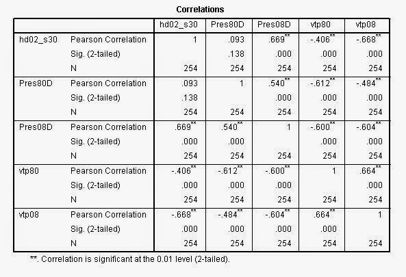 |
| This correlation matrix shows the five above variable in the order they were displayed. There are a number of associations here. Generally, areas with high percentages of Hispanics have high percent democratic vote. These areas also have low voter turnout in each year, 1980 and 2008. There are positive relationships as well between the variables that have entries in 1980 and 2008. This makes sense, as these areas would most likely not change drastically in that time frame. Another interesting correlation, is the negative relationship present between the democratic voters and voter turnout. This means that areas with high high of democratic voters have low percentage of turnout. |
After studying these correlations, it is safe to assume that they are all related. The correlation between Hispanics and democratic vote points to the fact that Hispanics often vote democrat. This can be attributed to the democratic party's commitment to social equity programs, favorable immigration policies, and even some progress in the way of reform. With this in mind, areas with high Hispanic populations also have low turnout. This can be explained by many Hispanic peoples' unwillingness or inability to vote- with many of them being undocumented. Additionally it is a familiar phenomenon that areas with high democratic vote also have low turnout. Republicans usually have better turnout due to voter restriction laws designed to attack groups that might normally vote democrat.
All of these variables lead to the conclusion that the Hispanic population does indeed affect the voting patterns in Texas. Although there is no data available for the Hispanic population in 1980, it is safe to assume that their influx has increased the democratic vote in the state of Texas. Particularly along the border with Mexico, clustering is present. This information could be useful for the TEC to refine voter advertisement techniques, increase/decrease accessibility for hispanic voters, or simply better understand the demographic makeup of their state.
All of these variables lead to the conclusion that the Hispanic population does indeed affect the voting patterns in Texas. Although there is no data available for the Hispanic population in 1980, it is safe to assume that their influx has increased the democratic vote in the state of Texas. Particularly along the border with Mexico, clustering is present. This information could be useful for the TEC to refine voter advertisement techniques, increase/decrease accessibility for hispanic voters, or simply better understand the demographic makeup of their state.
No comments:
Post a Comment